
The importance of white space in design.

Just jargon.
Aaaah, white space. The magical, mystical jargon of graphic design, but when you break it down, it’s really not that tricky to understand.
White space when talking about design is literally just that, white blank space.
It means that your design, let’s say a poster, for example, isn’t chock full of text and images from top to bottom and side to side. It gives space for the design to ‘breathe’.
The best way to explain white space is with an example, seeing is believing after all 😉

Comparing the two images above, which one is easier on the eye? Which one makes you want to read it? Better yet, which one makes you want to look at it?
Just because there’s spare or empty space on your page, card, flyer, website - whatever, it doesn’t mean it needs to be filled.
White space doesn’t have to be white.
Now, I should point out here that white space doesn’t always have to be white…
What?! Now I’ve confused you…
If we dive in a bit deeper, white space doesn’t mean just white. Could you imagine if every design and designer ever, just had white, white space? Wow. Boring. Even for us.
There would be a lot of white everywhere. Everyone’s designs would end up looking similar - if not the same. Which is neither good or imaginative.
White space is basically any space that has been left empty - regardless of colour.
White text with blue background/border? White space.
That chunk of nothing above and below your heading? White space.
That background of your image without text or focus? White space.
It all works together with hierarchy and making sure the the key details that you want to emphasise in your designs are the main focus.
Here’s another example to help try convince you and further drive the point across.
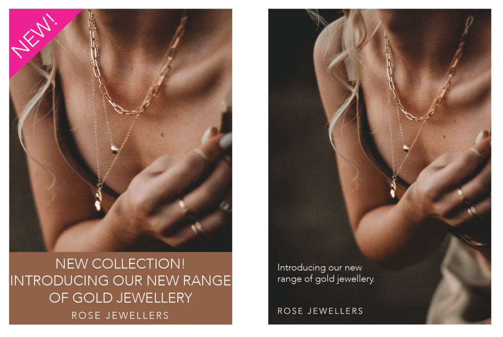
Again, comparing the two, which one is easier on the eye? Which one is more appealing?
If you say the first one, we probably won’t agree on much when it comes to design and we can’t be friends 😉
But in all seriousness, the second one, with the white space, is conveying the same message and imagery, yet through the use of white space it:
is easier to read
is easier to look at/on the eye
more appealing visually
looks professionally designed
If you couldn’t already tell, Ivory Edit lives, breathes and loves white space… In everything. One of my favourite mottos is ‘less is more’ and this is a strong and driving factor in all our designs.
Long, rambling story short, and what you should really take away from this post. Whether you’re a DIY’er or you’re looking for your next designer, white space is your friend. It helps your design to breathe. It gives way for your important details to stand out on the page.
It’s more than just white, blank, empty, wasted space on your page. Think of it more as a design enhancer.